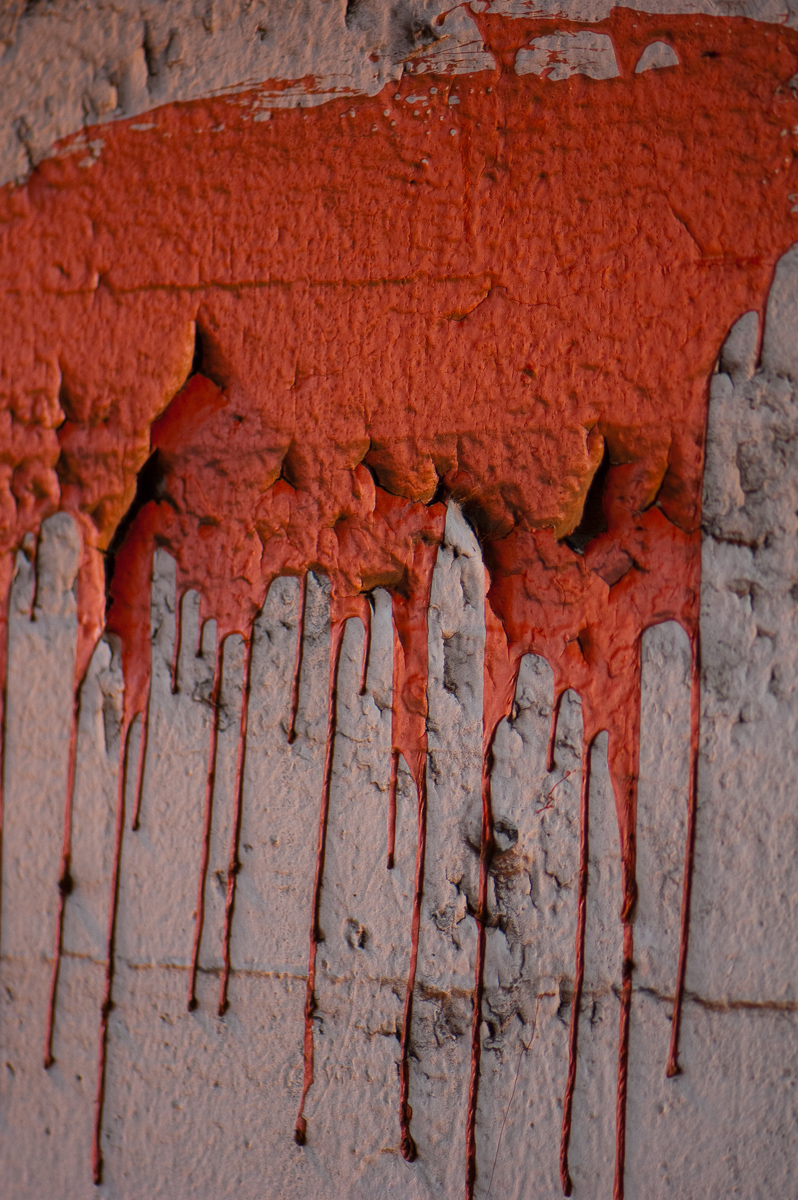
Paint Splatter

Took this one a weekend ago or so when it was cooler out. You can’t really tell, but the lighting for this one was atrocious. I actually took this one under a bridge on Ogden, where the Metra goes over. It’s amazing what a little post processing will do.
On another note, does anyone else hate the new DLP commercials? You know, the ones with the girl in the pink dress and the elephant? The bother me to no end because of the colors. The pink dress is way too saturated, and her skin tones are not right at all. They look very dull and dark, which is completely wrong for the processing they’ve done with the dress. It looks as if they’ve used a yellowish colored soft box on both the girl and the elephant too, but not any of the other actors if there are any in the commercial. Nor is the background lighting at all the same. It’s just very annoying I guess.
Leave a Reply