
Signs are definitely a large part of living in the city. There are ads and signs all over the place. I honestly have no idea what this one is for though. I just enjoyed the two different font types, and the star over the “I”.
Signs are definitely a large part of living in the city. There are ads and signs all over the place. I honestly have no idea what this one is for though. I just enjoyed the two different font types, and the star over the “I”.
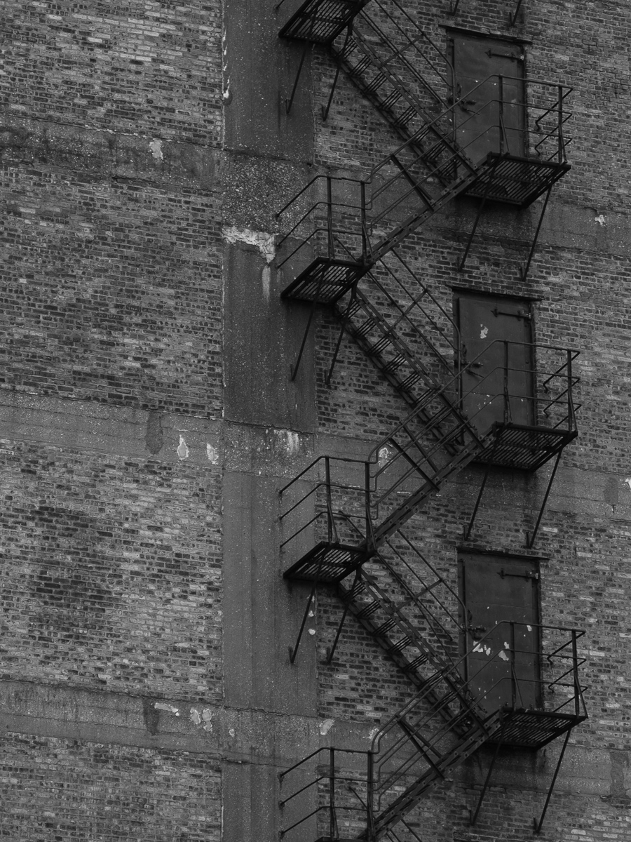
Wow, I actually got out this weekend and took a picture of something. I’m definitely sensing more of an industrial feel to many of the images I’m taking lately. It could be because I only seem to get out around my apt. I haven’t been really doing anything else of late. Work, come home, work out, sleep, rinse, repeat. So exciting!
Anyways, this is one of the cold storage buildings over by my house. I wish I had a different lens because the fire escape goes all the way up the side of the building, some 15 stories. It’s really quite impressive. Alas, with the 105mm lens, you only get three floors of that.
Amazingly, around where I live there isn’t a lot of graphiti. However, I think it’s because if there is any, someone quickly covers it up with a fresh coat of paint. I’d hate to think how many layers are on some of the buildings around here.
Update
Oooh, my new toys are here! I got my monopod, tripod, head, filters and bag! The monopod and tripod are a lot thicker than I thought they’d be, but the ruggedness is a good thing. I can’t wait to start using them. You may see a Chicago skyline shot in the near future.
Not a whole lot to say here. Just needed to get something up.
However, I did order a lot of new camera stuff! I’ve got a tripod, monopod, head, bag, and filter system coming. I pretty much cleaned out that want’s list real quick like. Everything should be here on the second. I can’t wait!
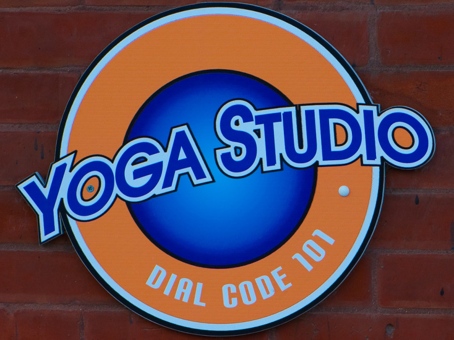
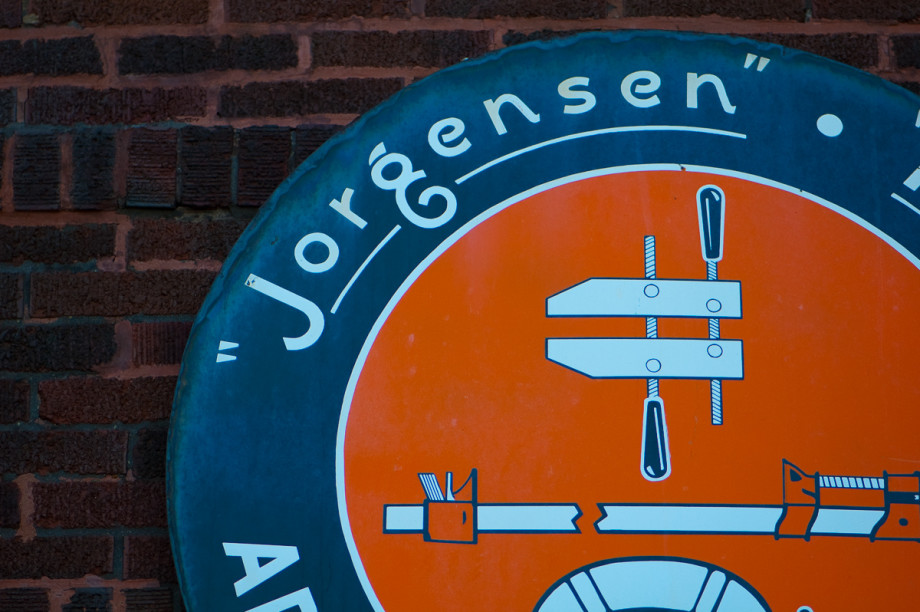
Yet another orange and blue sign. I’m sensing a theme around these parts.
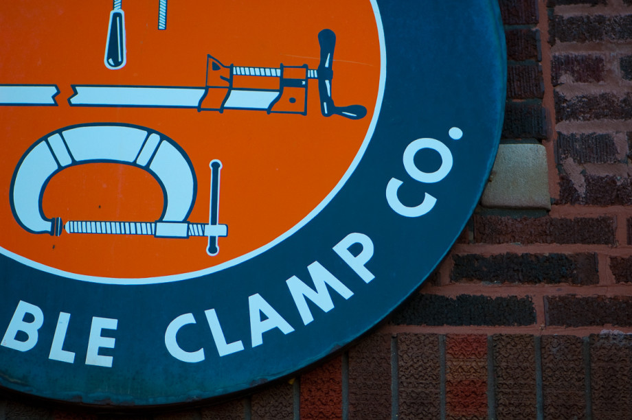
Like I said, part two of the Jorgensen Clamp sign.
The nice thing about living in the city is that there are so many different buildings, companies, and company signs. Today’s and tomorrow’s images is a great example. The signs have to have a certain contrast about them, otherwise they wouldn’t stand out.
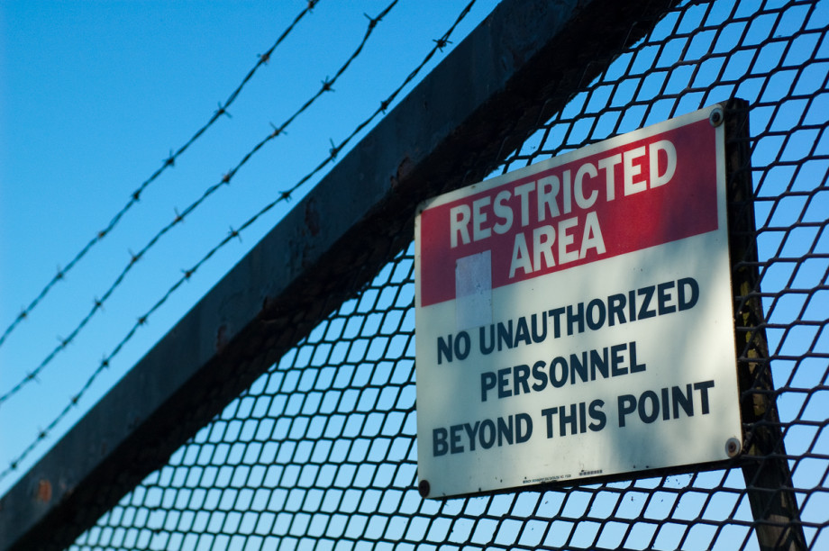
This image was actually taken the same day as Restricted, just on a different part of the barricade between the park at Navy Pier and the unknown pier next to it. I really like the contrast in this shot along with the blue sky and darker blue water in the background.
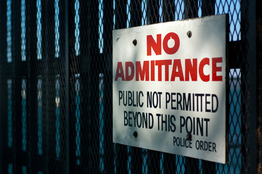
This is an older image taken this summer at Navy Pier. I don’t remember what the pier is next to Navy Pier, but it’s definitely off limits to pretty much everyone, just as this sign says. I don’t know about you, but signs like this just make me want to find out even more.

Well, this is the first weekend picture I’ve posted (a little late though). I think I’m going to save the weekend pictures for more “fun” items such as this. Other than that, I don’t really have much to talk about. As I mentioned a few days ago, I received my new lens, so you should start to see some of those images popping up, and I’ve updated the buy and about areas. For some reason I can’t get the email links to actually show up as links on those two pages though for Internet Explorer. Weird.